Canoe Clothing Company


Retail Identity and Branding System

Create the Quintessential Hawaiian Clothing Brand
The visitor industry in the late 1980's was caught up in an era of "brass and glass." Hawaiian style design was almost non-existent. The mandate from our client, innovative at the time, was to develop a brand identity and series of stores based on purely Hawaiian concepts.

Using local materials, design motifs and architectural references, we succeeded in building a retail concept that appealed to residents and visitors alike. By making a strong investment in a coordinated and thorough identity program, from signage to receipt paper, we built the brand quickly and effectively. When L.A. Style wrote up the store, they led with the packaging.

Since the Canoe concept was launched, there has been a resurgence in Hawaiian style motifs, and the store has been a "model" for many other retailers and restaurateurs. Canoe has won the Honolulu Weekly's "Best Of" accolade and a wide range of design and visitor industry awards.


Letterhead
The design motifs were based on tapa patterns and stylized woodcut scenes. They were translated and applied to a complete range of collateral, from letterhead to receipt paper.


Letterhead
Left: Canoe's first ads in the visitor publications picked up the postcard concept from the hang tags and warned visitors to "choose your native costume wisely." Right: The second generation of advertising supported the new positioning line "Dress like you live here" with classic photographs altered to include Canoe's merchandise.


Letterhead
The letterhead was printed on a speckled recycled stock with a very subtle tone-on-tone overall pattern. It gave the effect of having been printed on tapa, which was accented by the irregular border on the right.


Logos
The identity appeared on hang tags, labels, and embroidered and imprinted merchandise.


Logos
These hang tags were vintagepostcards with the actual written message printed on a vellum overlay. Customers mailed the cards to the folks back home, building awareness for Canoe.


Letterhead
The gift box and tissue wrap, both printed with Hawaiian motifs from the Canoe image bank, presented the merchandise with style.


Letterhead
The van as billboard - Honolulu has the some of the strictest signage laws in the US. We used the van as a to way broadcast the name around town (without breaking any signage laws). The van was so distinct it created a perception that Canoe had a fleet of vans instead of just one.


Expressing the brand
through the store design

Canoe on Main Street, Hawaii
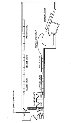
Compared with other Canoe stores we've designed this one presented a special challenge. The space was long and narrow, and pulling traffic all the way through to the back would require some real ingenuity. After a weekend research trip to sleepy Hilo town, we decided to use "a stroll down Hawaii's Main Street" as the metaphor for the new store design.

Working from photos of Hilo, Kaua‘i and O‘ahu, we designed a series of fixtures, reminiscent of little local stores, whose architecture reflected our colorful island cultures - from Hawaiian to Chinese, from surfers to paniolos. This device let us keep the stimulus level high while framing the merchandise in a uniquely Hawaiian context.

To keep the many little stores in character, we used many local materials to support the theme; coconut wood flooring, carved tikis, tapa, bamboo, coconut thatch, tin roofs, board and batten siding, etc. We painted the ceiling the color of the sky between sunset and darkness, a deep purple blue that dramatically set off the merchandise and fixtures.

We also decorated each of the fixtures with suitable objects and images; glass fishing balls, old sheet music, sake containers, and to top it off, a crowing rooster atop the Paniolo store.

Letterhead
The store was 17' wide at the street, but only 11' wide beyond the entry. To help pull traffic through, we installed a brightly lit 100 gallon salt water aquarium in the back wall.


Letterhead
Hilo's timeless Main Street district provided the metaphor for the theme. To entice customers through the long, narrow store we decided to treat the different fixtures with different architectural motifs based on Hawaii's colorful mix of cultures.
Letterhead
Among the cognoscenti, the cash wrap area evoked fond memories of Trader Vic's.


Letterhead
As planned, the aquarium was cool enough to draw visitors all the way to the back of the store. Our solution for the dressing room was a bamboo and coconut frond shack.
Letterhead
The Hawaiian store was modeled after some of the early beach concessions and souvenir stores.


Letterhead
The Paniolo Trading Post, the wild west with a Hawaiian touch. The rooster crowed.
Letterhead
The Japanese store. The sake's on the top shelf.


Letterhead
The paint and finishes for all the fixtures and walls were aged and distressed to evoke the passage of time.